Apple is continuing to adjust its bold new Liquid Glass design in iOS 26, dialing back the see-through aesthetic with the release of developer beta 3 this week.
The third developer beta reveals a noticeable shift away from the ultra-transparent look introduced at WWDC 2025, with changes aimed at improving readability and user experience.
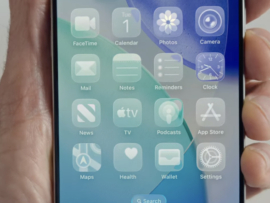
Across the system, visual elements have been reined in. Apple has increased contrast and reduced transparency in areas such as Notifications, Apple Music’s navigation bar, and other system apps, in response to complaints that the original aesthetic was “too flashy” and difficult to read.
The Control Center, which previously allowed home screen icons to shine through and confuse users, had already received tweaks in beta 2. Now, in beta 3, that trend continues across more of the system. Notifications now have darker backgrounds, and the navigation bar in Apple Music is no longer semi-transparent; it’s solid white.
Mixed reactions from developers and users
The updated look has stirred mixed reactions from developers and testers. Some see the latest tweaks as a necessary improvement in accessibility and usability; others say the changes strip away the futuristic design Apple teased just weeks ago.
“iOS 26 beta 3 completely nerfs Liquid Glass,” wrote Sam Kohl of AppleTrack in a post on X. “It looks so much cheaper now and feels like Apple is backtracking on their original vision.”
That sentiment is echoed across social media, with some testers accusing Apple of reversing course too quickly, while others welcomed the improved readability.
Design professionals have also weighed in. Allan Yu, a former designer at Shopify and Facebook, told Business Insider that while beta 2 was a significant improvement, beta 3 may have gone too far. “It took a step back to where design was anyways,” he said.
Serhii Popov, a senior software engineer at MacPaw, added, “As an Apple fan, I’d love to have a customized option so I can choose what effect to use.”
Some are now calling for Apple to let users customize the level of transparency in system settings, an idea that could strike a balance between flash and function.
“Announce a huge redesign just to throw much of it away. Apple should be allowing users to choose how much glass they want instead of just reversing by 75%. At least rename it now to Frosted Glass,” said Mark Gurman, Bloomberg’s managing editor.
Still, not everyone is upset. Some users on Reddit appreciated the changes for accessibility reasons. As one user put it, “It was pretty unreadable for anyone without perfect vision and this addresses that, which is ultimately more important than pretty glass graphics.”
Still a work in progress
iOS 26 is still in early testing; developer betas are designed to gather feedback, fix bugs, and refine features before the public release. Apple typically finalizes the software by September, just in time for its new iPhone launch.
In the meantime, many hope Apple will find the right balance between innovation and usability. Apple has not issued an official comment in response to the backlash. However, the company is expected to continue refining the Liquid Glass aesthetic over the coming weeks.